How to Design Your Own Flyer
0 minute read
Six Steps to Designing Your Own Flyer
So, you're planning a leaflet distribution campaign. You've got your message ready, and now you're thinking, "I'll design the flyer myself." It sounds simple enough, right?
With easy-to-use tools like Canva, anyone can jump in and be an overnight designer. But, before you dive in, in this blog, we take a closer look at what goes into creating an effective flyer—and why, ultimately, using a professional designer might be your best move.
DIY Flyer Design: Where to Start
Designing your own flyer can be fun. You know your business better than anyone else, and software like Canva makes it easy to start creating cool-looking flyers with drag-and-drop functionality.
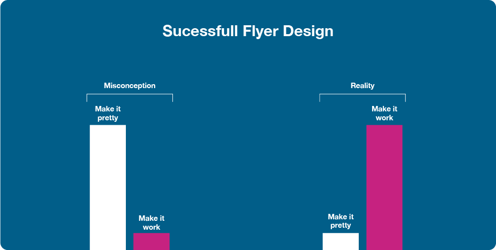
But if you want your flyer to be more than just "nice," it's best to understand the principles behind great design. Here are the key elements that the pros consider:
1. Who's Your Audience?
Before you even touch a design tool, the first question you should ask is, "Who is this flyer for?" Is it for busy parents? Young professionals? Retirees? Basically, who's your ideal customer? The design should resonate with these people.
2. Create an Engaging Headline
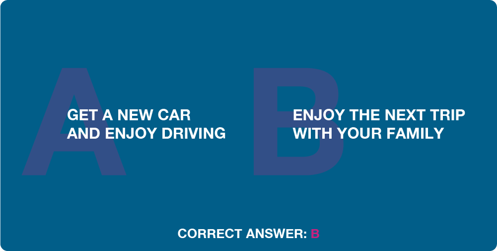
Once you've nailed down your audience, the next step is creating a headline that makes them look twice! Your headline is the hook—it needs to draw the right people in.
This isn't just about clever wordplay; it's about understanding what your audience cares about and communicating it in a way that grabs their attention.

3. Use Eye-Catching, Relevant Imagery
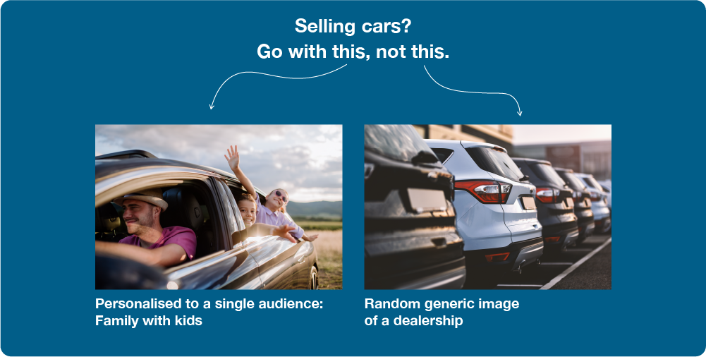
After the headline, the image is what will stop someone in their tracks. Choose an image that resonates with your target audience—something they aspire to or something that evokes emotion.
A high-quality, relevant image can make all the difference, but it has to align with your message. Be wary of using generic stock images that don't fit your brand or message.
Top Tip: Don't show what you do, but show why you do it - why it benefits them. For example, an image of your BMW showroom is boring, yet a photo of an attractive, happy family driving along a beautiful coastal road demonstrates the why - the positive emotions your product creates.

4. Include a Clear Call to Action (CTA)
Your flyer should always direct your audience toward a next step. Whether you want them to visit your website, call for a quote, or visit your store, the call to action (CTA) needs to be clear, visible and enticing.
Note: A discount isn't always necessary; sometimes an invitation to explore or learn more can be just as compelling.
5. The Reverse Side: Keep It Simple, Keep It Focused
On the back of your flyer, you typically want to expand on the message from the front concisely and clearly. Use bullet points to summarise key benefits or features and reiterate your CTA. This is where you deliver more detail, but make sure it's easy to digest at a glance.
The reverse is ideal for adding credibility and trust, such as a testimonial, award wins and other credentials. It's also where the necessary things, such as contact details, typically fit.
6. Choose the Right Size and Print Type
Now that you have all your ideas gathered together, how will these headlines, images, and info fit? Should you go with A5, square, or maybe A4 folded to A5? The size and format will depend on the content, your distribution method, your target audience and your budget.
After you've chosen the size, it's essential to ensure your design is print-ready - set up with the right bleed margins, high-resolution images, and in CMYK colour mode for printing. And don't forget to proofread! Typos can ruin even the best design.
What the Pros Do Differently
Now, if you've followed these six steps, congratulations! You've just taken on the role of a copywriter, graphic designer, marketer, and print specialist in one go.
But...
Yes, you can design your own flyer—but that doesn't mean you should?.
Think of it like DIY home repairs. You might be able to paint a wall yourself, but that doesn't mean it will look as neat as if a professional decorator did it - cutting in, no runs on the gloss, etc.
The same applies to flyer design. A professional graphic designer brings experience and expertise that takes your flyer from "good enough" to "wow." And that "wow" factor is what often leads to a higher response rate, better customer engagement, and ultimately, stronger ROI.
Here's what pros bring to the table:
- Audience insight: They're experts at figuring out exactly what will catch the eye of your target demographic.
- High-impact visuals: A professional designer knows how to choose the perfect images, colour schemes, and layout to create an aesthetically pleasing flyer that also works strategically.
- Flawless execution: Pros ensure the flyer is formatted correctly, prints perfectly, and avoids costly reprints.

Should You Trust the Pro's at Mr Flyer?
At Mr Flyer, we've designed thousands of successful flyers and have established exactly what it takes to make your flyer impact those target customers. With continual iterations to ensure each flyer we design is stronger than the previous, we help you get the best possible return on your investment.
And...it's not as expensive as you might think. For as little as £150 (+ vat), you can have a professionally designed flyer bespoke to your campaign goals, audience, and brand. Imagine the time and effort you'll save, not to mention the extra response rate a professional design can achieve.
Next Step
If you're serious about making your leaflet distribution campaign as effective as possible, let our in-house designers handle the design. We'll take care of everything, from understanding your audience to delivering a print-ready file that looks amazing and performs even better.
Contact us today to get started.
Or if you are someone looking to build your career in design or marketing, platforms like Jooble can be a useful place to explore relevant job opportunities.
