The Ultimate Graphic Design Page
Discover how to plan and execute incredibly effective graphic design for your business.
Enquire todayWelcome to Mr Flyer's dedicated graphic design page. This page condenses all the vital information your business needs to plan and execute business-building artwork.
1.
Reveal the true cost of graphic design.
2.
Discuss the fundamentals of creating an effective brand.
3.
Explore the do's and don'ts of actionable flyer design.
4.
Share how to implement incredible graphic design specifically for marketing and advertising.
About Mr Flyer
Since 2011 it has been our mission to build our customers business and build their brand through printed marketing. We provide multi-award-winning marketing strategy, artwork, print, nationwide leaflet distribution and direct mail, all undertaken in our 15,000 sq. ft facilities based in West Yorkshire.
To give you extra assurance that what we are about to share with you is credible and beneficial for your business, we are members of the JICMAIL (Joint Industry Committee for Mail), DMA (Data & Marketing Agency), IPIA (Independent Print Industries Association), Love Paper, Two Sides and the SME Climate Hub. We also hold ISO9001, ISO14001 and ISO27001 accreditations, and most recently became an accredited World land Trust Carbon-Balanced Printer.
Is Graphic Design Costly?
It seems appropriate to begin with one major concern that may well be running through your mind right now, "Is graphic design costly?". This is a legitimate concern. What we discuss with clients is the resultant value of the graphic design we produce. Always consider the cost in relation to the return your business could receive. Equally, evaluate the potentially damaging impact your business may face if ineffective and unprofessional artwork is selected.
Quite a few clients prefer to go cheap with their design and focus on quantity over quality. However, the professional, compelling and actionable artwork by Mr Flyer is just £55 per hour. In context, for a 20k door to door distribution campaign, the price for print and delivery may be around £2,500; therefore, it's hazardous to use amateur artwork for this
kind of investment. Instead, the safest move is to invest in actionable artwork created by experts.
The cost vs value ratio is the case with all aspects of artwork. If you spend very little on branding, that weak brand represents your business; everything you subsequently design has to work around cheap branding. Whether you need business cards or a complete re-brand, signage or social media images, leaflets or letterheads - all of these should be designed professionally to represent your business to its full potential.
Each time we have re-branded, we have achieved a noticeably higher perceived value from our clients. People judge you by your cover, whether you like it or not!
Branding
According to the dictionary, "a brand is a particular identity or image regarded as an asset." So not only is your brand an asset on your balance sheet but, more importantly, in the minds of your prospects and customers.
Small businesses can now appear significant players within their chosen niche thanks to the internet and low-cost marketing options available. Your brand then will determine how others perceive you as a business. For example, do you portray trust, consistency and professionalism, or an ad-hoc mismatched message?
Your branding, from your social media to your website, business cards, and direct mail campaigns, must all align to succeed in your marketplace.
Branding Fundamentals
To keep things simple, the fundamentals when considering a new brand or re-brand are:

1. Purpose

2. Colours
3. Consistency
Always begin with purpose in every marketing activity. What do you want to achieve with this brand - start with the end in mind. The purpose will dictate colours. For example, we consider two printing companies, one to provide high-end bespoke print and another to provide environmentally friendly print solutions.
The high-end one may go for rich blue's, whereas the environmentally friendly brand will likely opt for light greens. The purpose and colours are then consistent. Consistency then leads to keeping every element of your brand consistent - in print and digitally.
The Process
Whether you're building a new business or product or re-branding an existing one, our three-step design process is proven to generate great business brands. We use our unique '3 D's' strategy, which includes:

1. Discovery
2. Design

3. Delivery
- Discovery. A consultation - what you're trying to achieve.
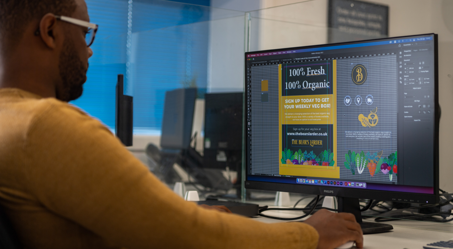
- Design. We flesh out your brand - logos, imagery and colours, how to implement it, and how it works in different places (we use mockups for this).
- Delivery. We produce a final product - including a brand guidelines document, flyer design, marketing collateral, and much more - bespoke to your requirements.
This three-step process gives clarity to our process. It enables you to know what to expect next. But, most importantly, it leads to the creation of really incredible brands.
If you would like to speak with us about a new brand or re-brand, please do contact us today.
Enquire todayELR Case Study
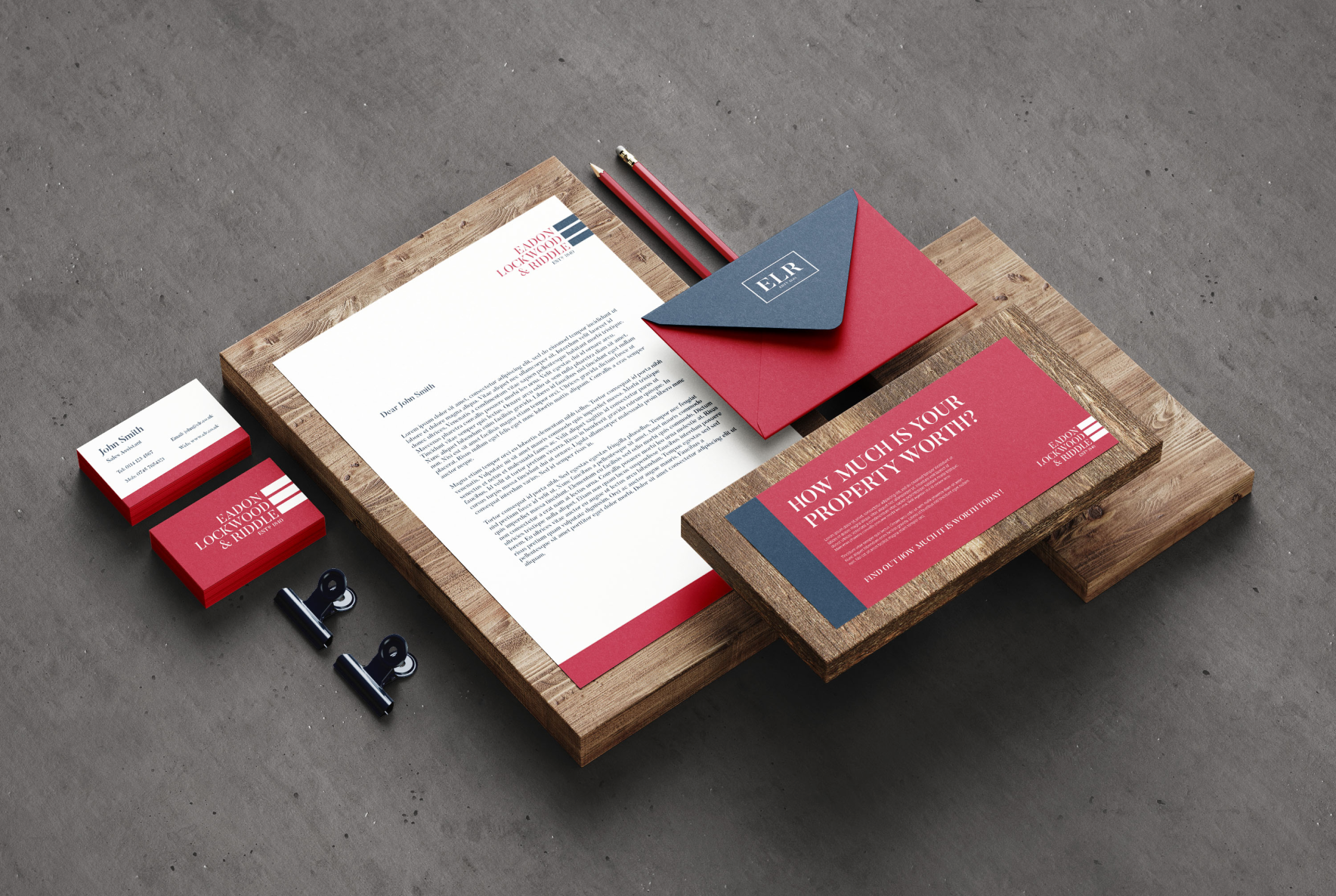
In this case study, ELR, a reputable, long-established multi-branch estate agent, acknowledged their brand no longer represented them effectively. We were briefed to modernise the brand whilst maintaining a connection with the existing brand. Their properties were typically beautiful country homes and other affluent properties. Therefore the brand's purpose had to be consistent with this.
Mr Flyer did such a great job with refreshing our branding, Rodger understood exactly what we needed and helped us tap into our true brand potential - Chris Thompson (ELR Director)
Leaflet Design
No matter how good the quality of paper you print on, how frequently you deliver, or the precise targeting we carry out for you... if your design is terrible, none of this will benefit you!
The statement above is from a popular blog we created several years ago titled 'Design is Everything, Everything'. When designing for leaflet distribution, there are fundamental principles that, when adhered to, significantly increase your response rate.
Over the last ten years, we have seen thousands of flyer designs, some terrible, some perfectly adequate, and some extraordinary. We have equally designed more flyers than all of the other items we design combined! As a result, we have honed down to the incredible nuances vital for an actionable marketing-focused leaflet design. By following our tried and tested system, you will catch the receiver's attention and give them an instant reason to respond to your business.
Our Flyer Design Solution
We cover our three keys in every flyer design, which have proved time and again essential for maximum returns:

1. Bold headline

2. Eye-catching image

3. Call to action
The bold headline is typically in the form of a question relevant to the receivers need. Support this with a sub-headline positioning your business as the solution. For example, the Greensleeves flyer featured below was sent out after the dryest spring in living memory, leaving everyone with a brown looking lawn. However, Greensleeves had a solution to their receivers need. This flyer was distributed to postcode sectors that had a high density of homes with gardens.
Greensleeves Case Study
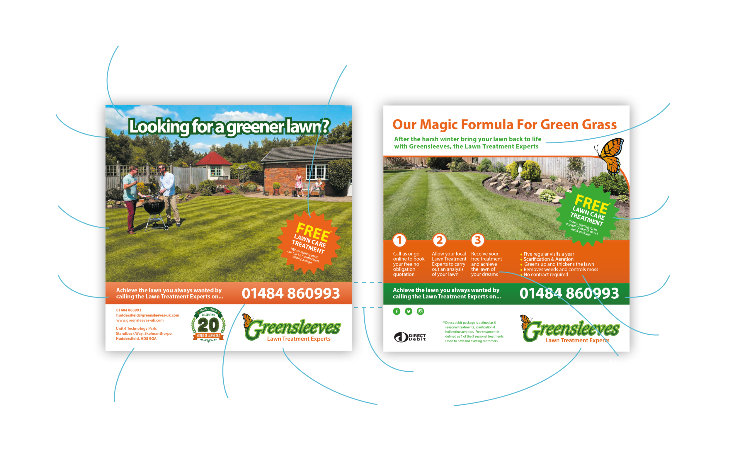
The eye-catching image is then of the benefit you provide and how it will make the receiver feel. It is NOT of what you do. Remember, in sales and marketing, no one cares what you do; they only care how it will benefit them.
As you see with the flyer above, we did not show an image of their lawn treatment equipment nor a gardener treating their lawn. Instead, we showed people enjoying a BBQ on a luscious green lawn within a beautifully kept garden. We demonstrated the benefit.
The call to action (CTA) is precisely that - a call to take action. It amazes us how many clients ask us to send out a flyer without any reason to respond included...and then wonder why no one responds!
All CTA's must create a win-win outcome. If the Greensleeves flyer CTA was, "We want to do more lawn treatments, call us today so we can do yours", that is not a win-win scenario. Yet many businesses do it, especially estate agents with lines such as, "We want to sell your house". This is a 'so what' statement, which doesn't deserve a response.
In the Greensleeves flyer, we positioned the CTA to benefit the receiver (a green lawn), which in turn benefits Greensleeves (a new client), creating a 'win-win'. We took this further by offering a free lawn care treatment if they signed up to a set number of treatments (again, a win-win CTA).
Some additional features we look to add to every flyer are credentials, as these help build trust. We used the 20th-anniversary logo to demonstrate longevity and the Which logo to highlight competence. The direct debit logo is also used as the free lawn treatment CTA is subject to signing a DD contract, which re-emphasises the CTA. We also look to feature a testimonial, again for enhancing trust.
Design No-No’s
- Unprofessional/DIY artwork
- Informational instead of actionable
- Irrelevant to target audience
- Dull images
- 'So what?' headlines
- Lousy or non-existent call to actions
- Single-sided
- Too big
- Too small
- Too busy/cluttered
Mr Flyer helped us to create a much better image for our company, and since implementing the distribution campaign, our business has grown significantly. Jonathan Tucker - Holmfirth Personal Trainer
Why Choose Mr Flyer?
At Mr Flyer, our in-house design team are different because we specialise. We stick to what we know, and that is designing marketing-focused printed material to build businesses. We understand what works, what key elements should be included, and most importantly, what actually converts potential consumers.
Time and again, clients come to us with their artwork for us to print and distribute; we look at it and instantly know whether or not the campaign will be successful. So if you want to be sure that your upcoming flyer distribution or direct mail campaign will have the best opportunity for success, then please allow us to create the artwork for you!
Implementing Great Artwork
To implement great artwork, please speak with us as early on in the marketing process as possible. If you have a brand guidelines document, please make sure to provide that too. Please ask if you don't yet have one but would like to know the benefits (namely brand consistency, professionalism, and speed to produce new artwork). We can create one for you.
Our mission is to make life simpler, faster and cheaper for our customers and advise and educate them on the most successful strategies for business growth. Great artwork is fundamental to this mission!
Ready to get started?
To get your campaign going with great artwork as its foundation, please contact us today.
Get StartedAccreditations, Awards & Sustainable Commitments
Mr Flyer is a multi-award-winning company. We are ISO9001, ISO14001 and ISO27001 compliant. In addition, we are an accredited member of the DMA (Data & Marketing Association), JICMAIL (Joint Industry Committee for Mail) and the IPIA (Independent Print Industries Association).
Our Green commitments and credentials include, Carbon Balanced Printer with the World Land Trust, SME Climate Hub commitment and Love Paper & Two Sides members.
Customer Reviews
Mr Flyer is trusted by some of the UK’s smartest businesses. Why not join our continually expanding number of customers seeing a strong ROI with us.
